

Meteo app
Description
A new weather app designed to provide accurate, real-time forecasts—wherever you are. It tells you exactly when the rain will start or stop, but that’s not all: it also suggests how to dress, whether you can go out in short sleeves, if you should layer up or bring an umbrella. No more doubts, no more surprises—this app helps you step outside with confidence.
Client
Meteo app
Year
2018
Category
Brand design and app
Credits
martydax
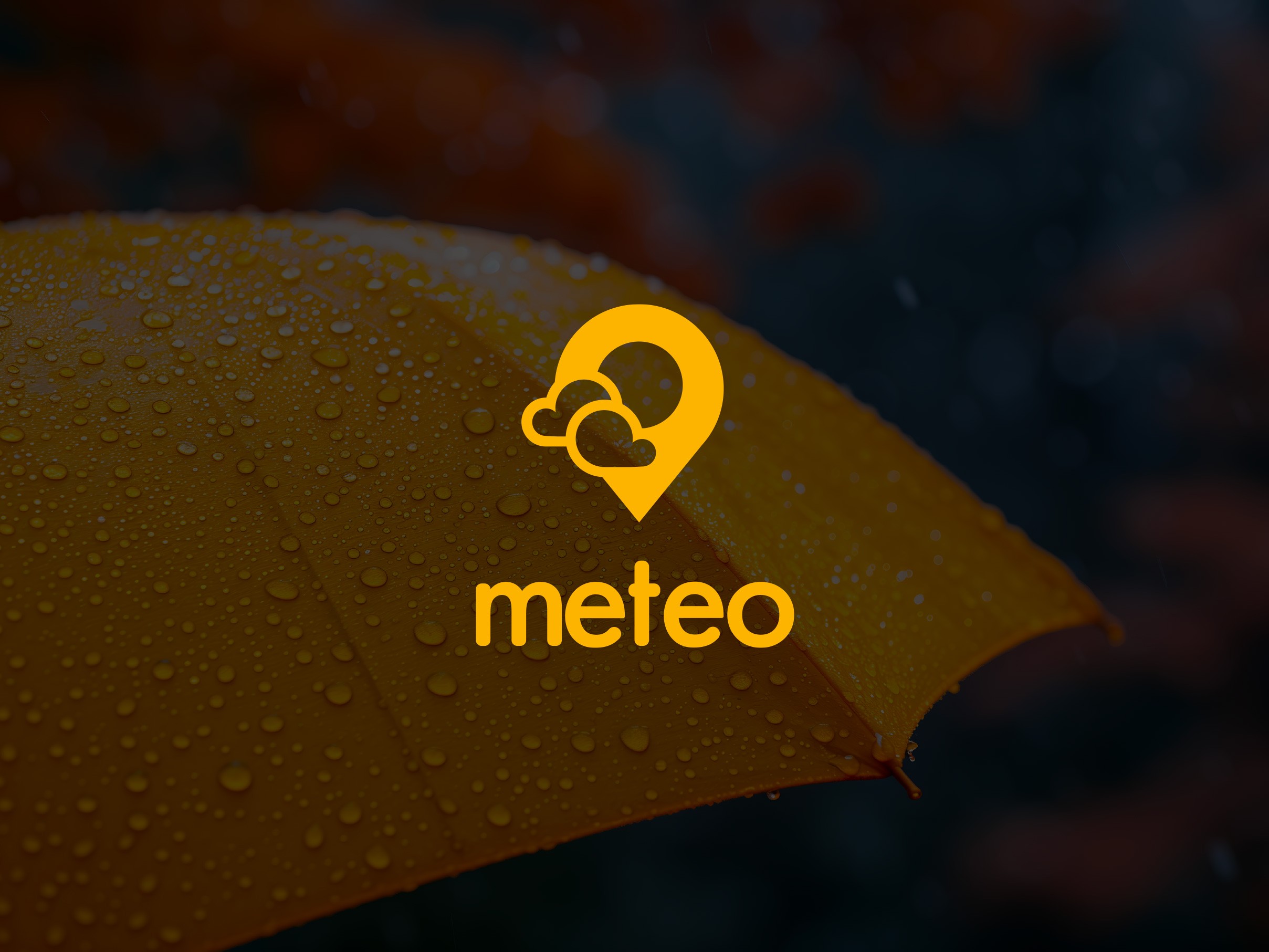
BRAND IDENTITY
The logo is built around two key ideas: weather and geolocation. It’s a simple yet distinctive icon that conveys the concept of a personalized weather map for each city. The color palette—yellow, grey, and dark blue—evokes different weather moods: yellow represents sunshine and optimism, grey reflects cloudiness and changeability, while dark blue conveys reliability and precision. The result is a clear, modern, and functional visual identity.

APP AND WEBSITE
The app is intuitive and easy to navigate: every feature is within reach, and the interface is designed for a smooth, effortless user experience. Users can access all the information they need in just a few taps, with no distractions. The app is supported by a landing page that highlights its key benefits, showcasing its everyday usefulness and smart functionality.

