Bontempo
Description
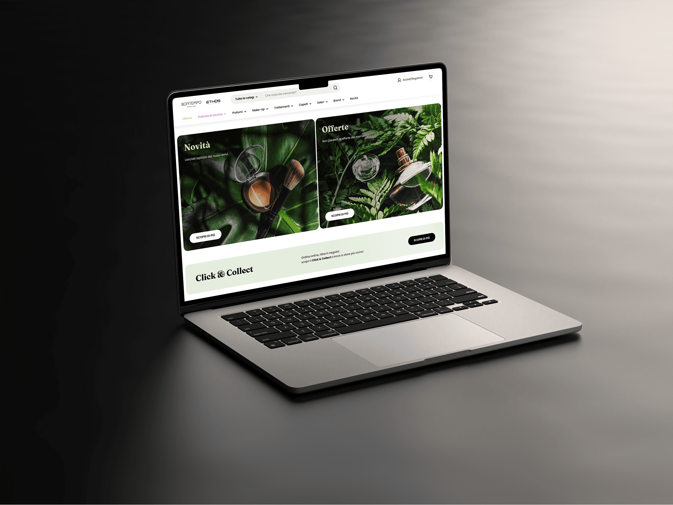
In the month after launching the new e-commerce website bontempoprofumi.it, built on the Shopify platform, we reached an impressive result: +102.96% more orders compared to the same period last year; +7.42% higher average order value. These numbers are not by chance. The new design made the user experience more clear, intuitive, and engaging. Navigation is easier, and we reduced friction during the purchase process. The new interface, based on minimalist design and visual focus, increased trust in the brand and made every visit smooth and conversion-focused.
Client
Bontempo
Year
2025
Category
UI/UI Design
Credits
Sidea Group
UX FLOWS
Initial Research
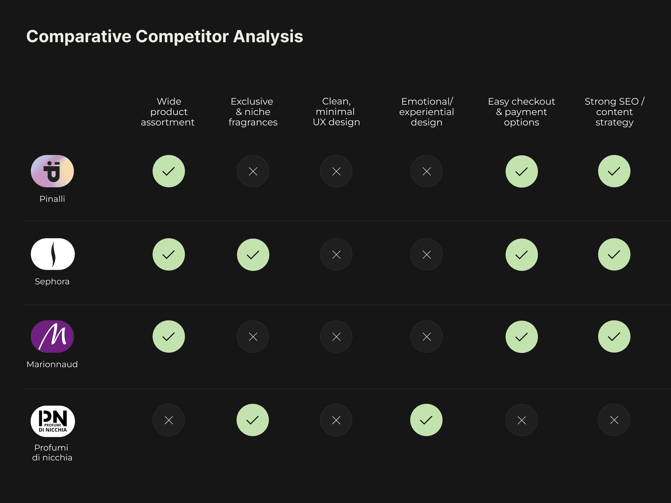
To get these results, I started with a deep analysis that included:
Benchmark of direct competitors in the fragrance and skincare market
Market research about online buying behavior (average spend, devices, frequency)
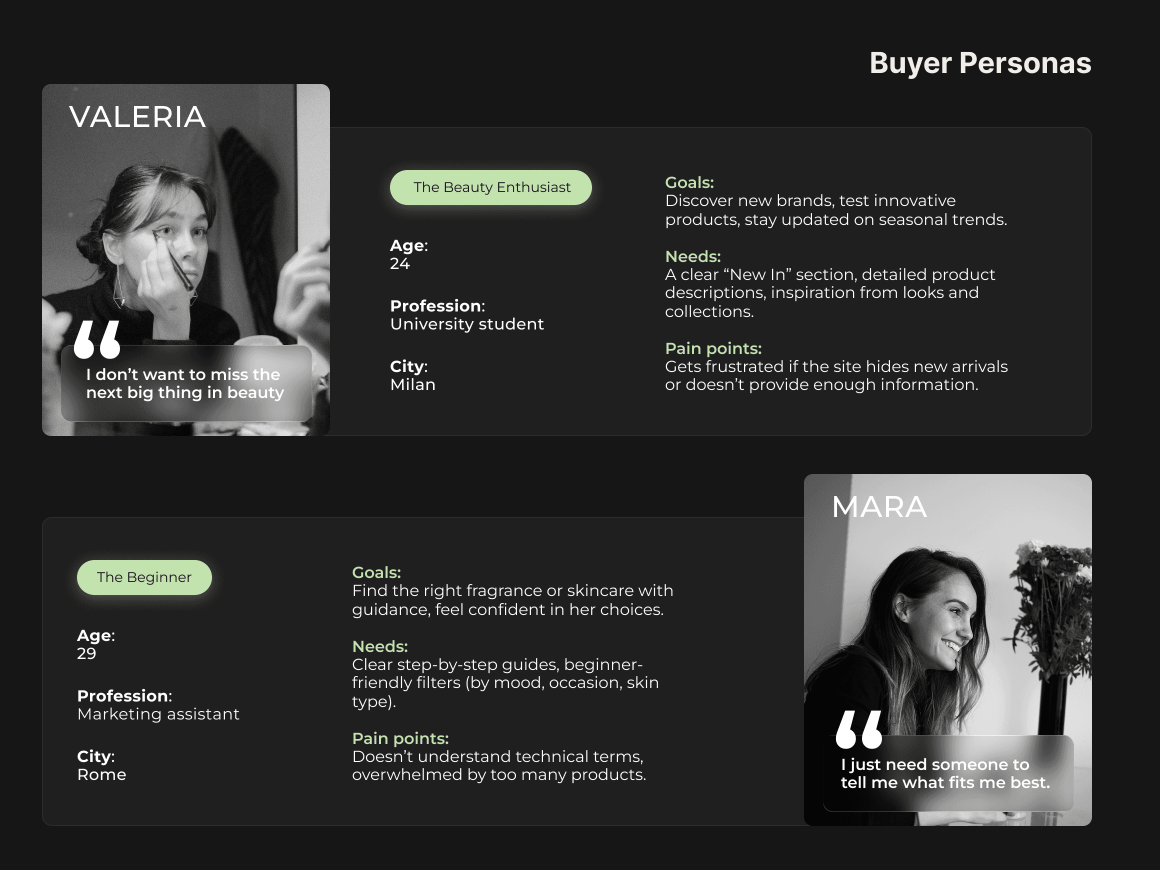
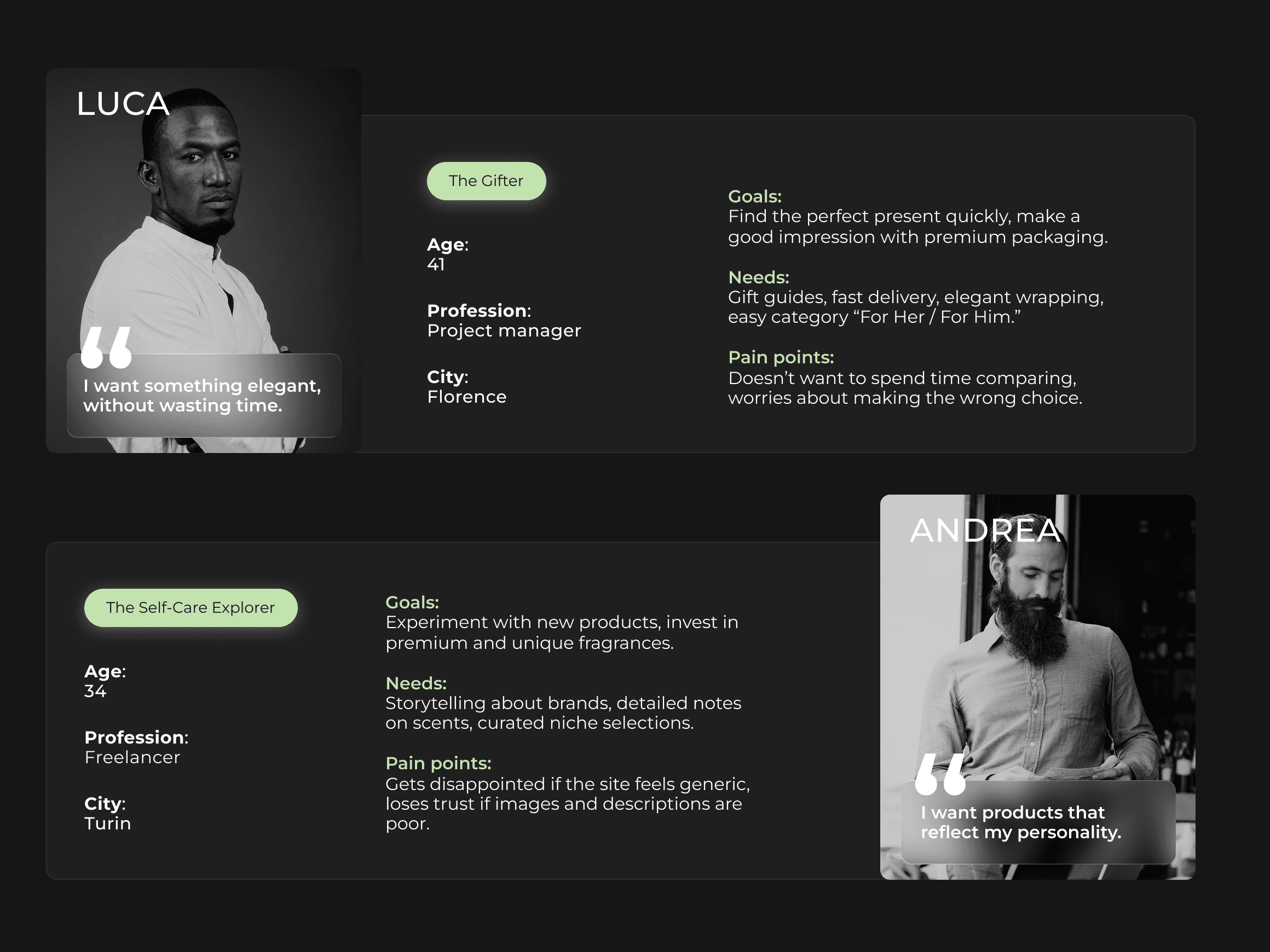
User segmentation between loyal and new visitors, studying their needs and difficulties
UX research to understand what users want, what convinces them to buy, and what they look for on a homepage at first glance
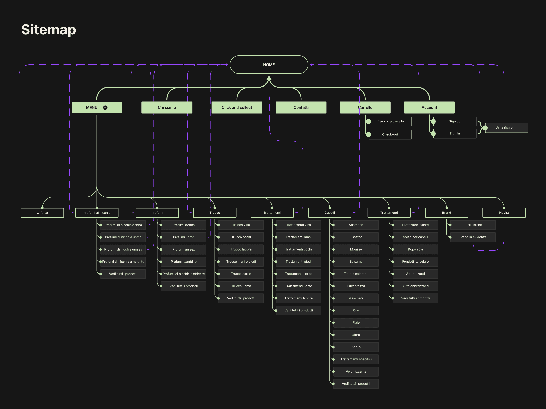
Main Improvements
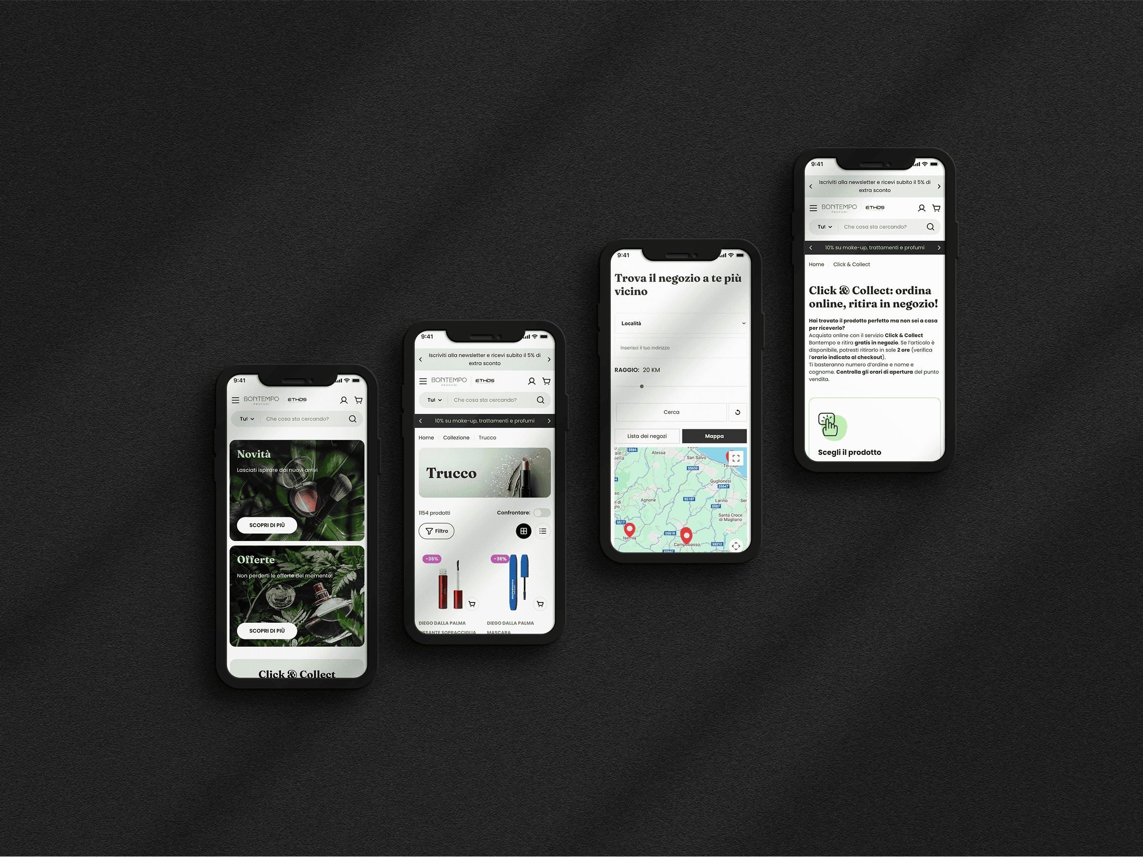
Persistent call to action buttons starting from the homepage
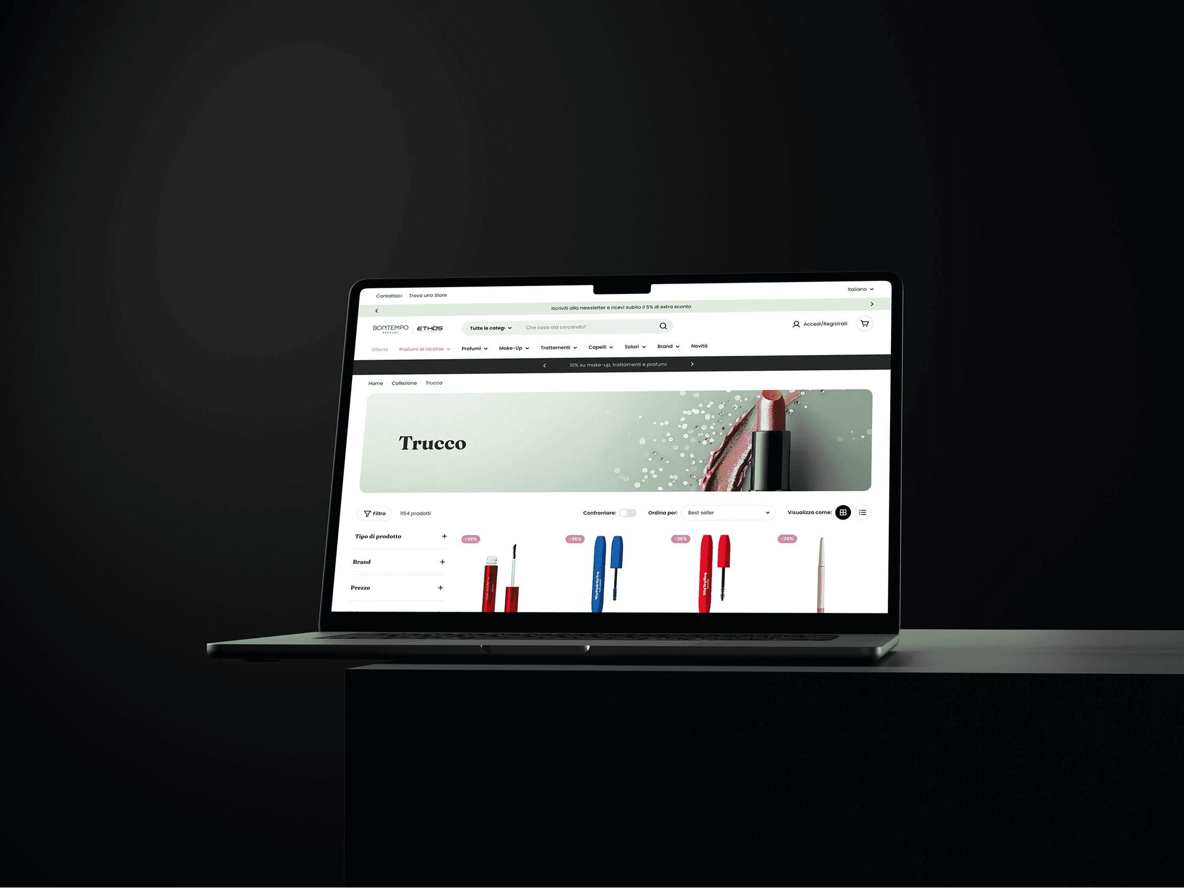
Less visual noise in product pages: only essential info, with “Add to Cart” always visible
New catalog and brand pages show only key info, leading the user directly to products and filters, avoiding extra content
Clear page hierarchy to guide the journey
✅ Takeaway: The redesign of user flows removed friction and improved the buying experience, turning the site into a conversion machine.
UI DESIGN
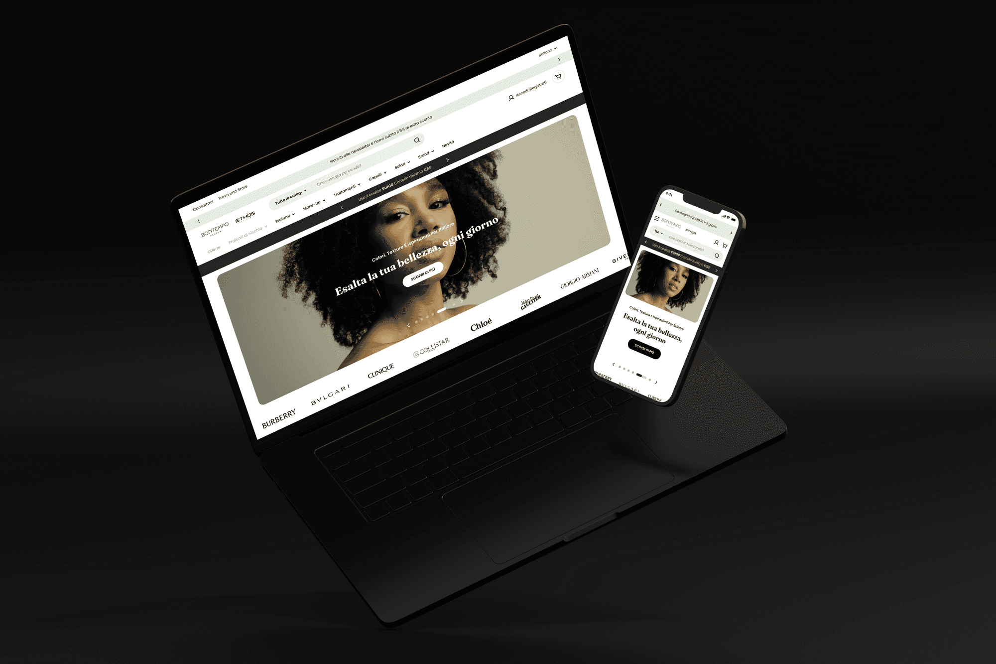
Minimalist and Action-Oriented Style
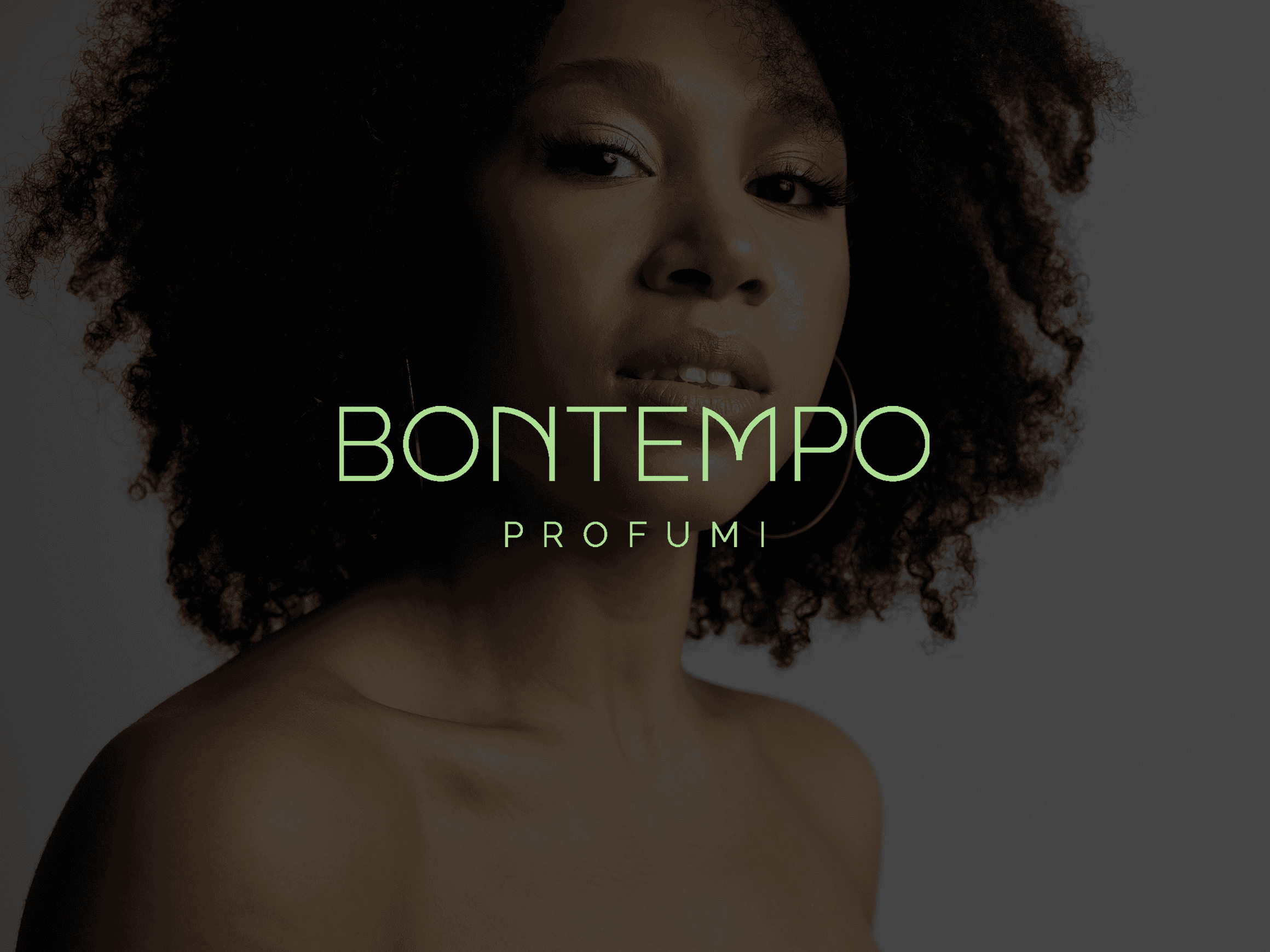
I chose a clean and elegant interface that fits a brand about perfumes, senses, and affordable luxury.
Color palette: The design uses the brand’s pastel green and lilac. The green was updated to a softer, easier-to-read shade. Lilac was used to highlight discounts and important info. To avoid confusion, accents and CTA buttons use different colors — CTAs are dark gray, stylish and strong.
Typography: Serif fonts for titles and sans-serif for body text. A balance of elegance and readability.
Spacing: Lots of white space to help focus and create a calm visual flow.
Why these choices?
Minimalism is not only about looks. Here, it increased product value perception, brand trust, and gave users a feeling of calm and control.
✅ Takeaway: A consistent, refined, and strategic visual design improved usability, conversions, and brand perception.